Designs · Builds · Ships

Felipe Muñoz — Agentic Designer

I design products and then build them for real — straight from Figma into iOS and web code. Lately I've got AI agents working right alongside me, so things ship fast.

LinkedIn
Felipe Muñoz
Profile
NowSr. Product Designer at Slalom — design systems and agentic AI workflows for enterprise teams.
BaseBogotá, Colombia 🇨🇴 — happily remote, any timezone.
Stack
FigmaClaude CodeSwiftUI More UnityFramerAdobe CC Suite
CV · 2026 Download

Selected Work

About

Experience
2025 — PRESENT
Senior Product Designer
Slalom
2025
Senior Product Designer
Hibrids · Coca-Cola (Coke XP)
2023 — 2025
Senior Product Designer
Botkeeper
2023
Product Designer
Huge · McDonald’s
2022 — 2023
Product Designer
Huge · Google (Tenor)
2021 — 2022
Visual Designer
Zemoga · Walmart
2018 — 2019
UX / UI Designer
House Control S.A.S
2015 — 2016
UX / UI Designer
Pokerroom · Luckia
Profile

I'm Felipe. I design products, then I build them for real. The part I love most is taking something tangled and making it feel obvious to use: the design system, the prototype, the real components, and the research that ties it all together.

Lately I've been leaning on AI to move faster. Claude Code builds right alongside me, and the Figma MCP lets it read my Figma files directly, so I can get from a design to working code in a few days instead of a few sprints. This very site? Made exactly that way.

I've designed for Coca-Cola, McDonald's, Google and Walmart through Slalom, Hibrids, Huge and Zemoga. And when I'm off the clock, you'll usually catch me building my own apps and games. Design and code, all me.

Capabilities

Design

Design systemsProduct · UXResearchPrototypingMotion · Rive FigmaAdobe Suite CC

Build

SwiftUI · iOSAndroidHTML · CSS · JSUnityWebflow

Agentic

Claude CodeCodex Figma MCP
What people say

He mastered our design system and processes remarkably fast.

Aaron BermudezAaron BermudezSenior Design Lead · Walmart

Felipe doesn't just design — he solves problems beautifully.

Manuela MillánManu MillánVisual Designer · Huge

Contact

Let's build something
fe.munoz66@gmail.com

Got something you're building? I'd love to hear about it — product design, design systems, or agentic AI, all fair game.

Channels

Press ⌘K anywhere to navigate.

Back to work Case 02 · Davivienda
UX/UI Case Study

Davivienda

A UX/UI redesign concept for one of Latin America's leading banks: rethinking its mobile app around clarity, security, and the features users actually need.

TypeUX/UI redesign case study
PlatformiOS (mobile app)
ScopeResearch → Strategy → Design
RoleUX/UI Designer
Project Overview

Redefining mobile banking for a seamless and secure experience.

Davivienda is one of the leading banks in Latin America, serving millions of users. Its mobile app faced usability challenges, outdated design patterns, and customer frustration driven by unintuitive navigation and limited accessibility.

18
Online surveys
3
Apps benchmarked
2
User personas
12
Tree test users
83%
Task completion
The Problem

Five friction points holding the app back.

The pain points surfaced consistently across surveys, interviews, and store reviews.

Complex Navigation

Users struggle to find essential features due to poor hierarchy and unclear categorization.

UXIA

Lack of Security

The app lacks Face ID login and dynamic passwords, reducing security.

SECURITY

Outdated UI

The current design is not intuitive, making some actions confusing for users.

UI

Information Overload

Key features like account registration and payments get buried and are hard to find.

UX

Limited Functionalities

Competitors offer a more intuitive interface with a better overall user experience.

PRODUCT
Research

Grounded in what users say, use, and expect.

Three research fronts shaped the redesign: direct user input, competitive context, and personas built from the findings.

18 online surveys with users aged 20 to 44, plus interviews, mapped how people actually use Davivienda Movil and where the experience breaks down.

Most used features
  • Bank transfers
  • Checking balance
  • Credit and card payments
  • Document requests
  • Product blocking and password change
What users want
  • Face ID and fingerprint login
  • Account registration from the phone
  • Clearer expenses and easier credit payments
  • Nearby ATM search and PSE payments
  • Simplicity kept, but more intuitive, with more useful features
  • Stronger security and a modern interface

Davivienda Movil measured against Bancolombia and Nequi through App Store reviews, to detect strengths to keep and weaknesses to fix.

Strengths across apps
  • Simple, stable, and reliable core flows
  • Attractive, intuitive design (Bancolombia)
  • Fast transfers and recharges at no cost (Nequi)
  • Responsive customer service
Weaknesses across apps
  • No PSE payments, fingerprint, or Face ID in Davivienda
  • Slow sections, complex menus, and low security
  • Crashes and unexpected closures
  • Users do not feel safe amid constant failures
What Users Said

Voices from the interviews.

Three users, three angles on the same product.

In some cases it does not make much sense to go to the bank, so it would obviously be easier if one did not have to go, and could do it through the app.
BA
Blanca Arevalo
Teacher
Overall the experience is good, but there are times when it is a bit confusing to do things, and times when it takes a while to load.
DM
Diana Munoz
Product Design Director
I can pay my phone and electricity bills at Bancolombia simultaneously and easily through PSE. Face ID makes access and tracking payments more convenient.
DS
Diego Sainea
Photographer
User Personas

Two people who anchored every decision.

Built from the surveys and interviews, Anna and Daniel represent the two ends of the app's audience.

AG
Anna Gomez
24 · Single · Tattooer · Colombia

"I would like to save up to have my own things."

A tattoo artist with one year of experience. She lives with her parents, earns from her work plus monthly family support, and dreams of buying an apartment and opening her own studio.

Core needs
  • Invest to create her own tattoo studio
  • Buy an apartment
  • Learn to manage her money
  • Travel
Frustrations
  • Trouble managing her money
  • Can't save enough to buy her studio
  • No credit access because of her income
  • Has to work more hours to save
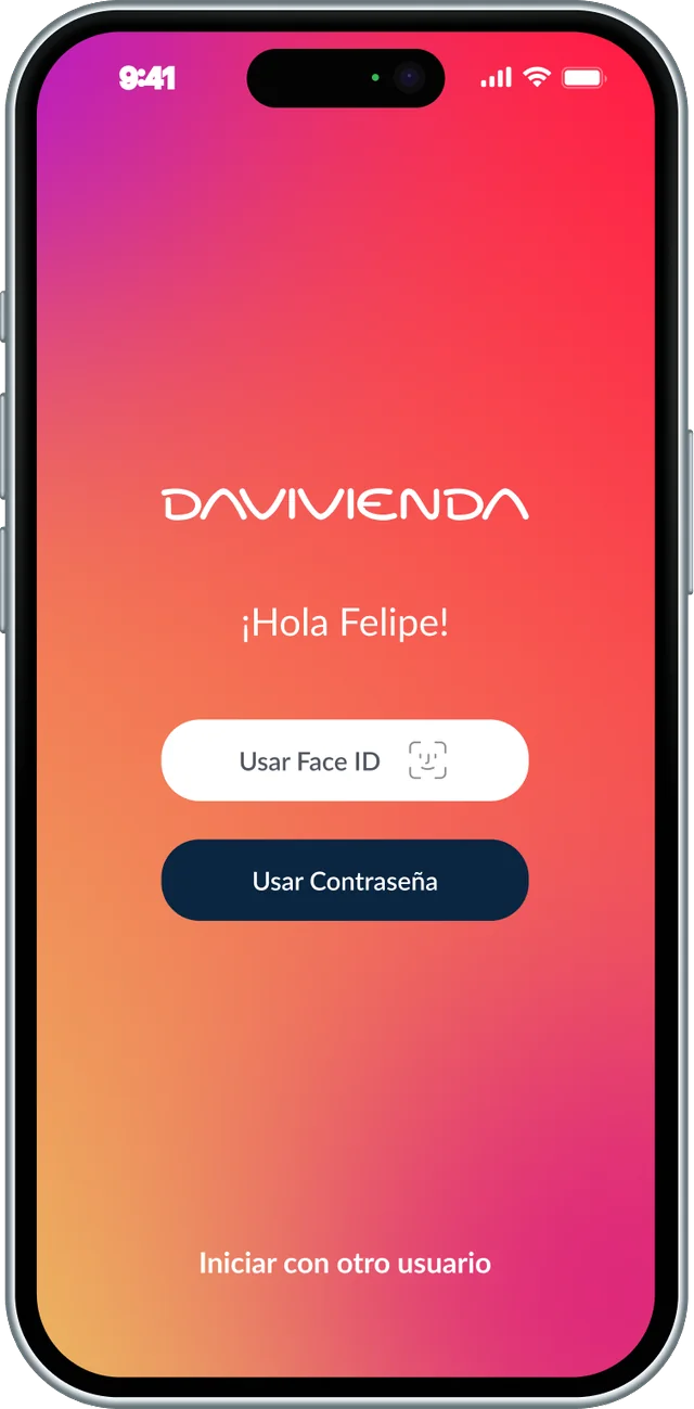
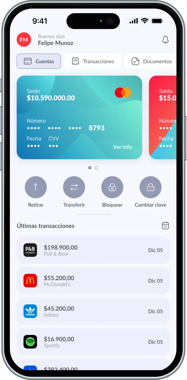
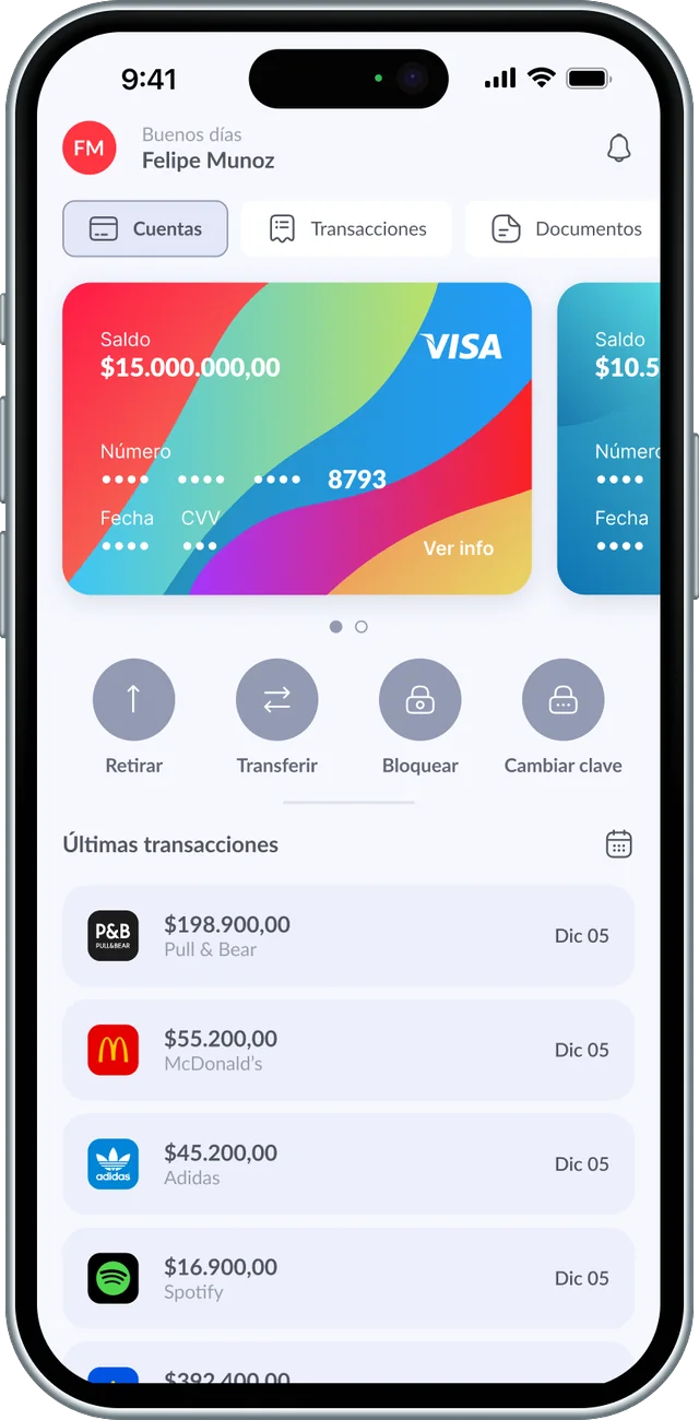
EXTROVERTINTUITIVECREATIVEDIGITAL PAYMENTMOBILE APP
DR
Daniel Restrepo
50 · Married · Engineer · Colombia

"I would like to invest more in myself, in my tastes and what I want."

An engineer for 25 years and head of his household. He wants to manage income and expenses in a simple way and save, with his children's university tuition coming soon.

Core needs
  • Pay for his children's university
  • Start saving for retirement
  • Buy the house they currently rent
  • Organize income and expenses
Frustrations
  • Doesn't know how to organize his finances
  • Not enough money to travel
  • Wants to change his car and can't
  • His personal budget is very low
INTELLIGENTCLOSE TO TECHNOLOGYDIGITAL + CASHMOBILE APP
Strategy

Business goals aligned with user needs.

Aligning both sets a clear path for the redesign: a smarter, safer, and more efficient banking experience.

Enhance Security

Face ID, fingerprint login, and dynamic passwords as core security layers.

SECURITY

Improve Navigation

Restructure the app for easier access to key features.

IA

Increase Engagement

Introduce everyday tools like ATM locators and PSE payments.

PRODUCT

Optimize Performance

Reduce loading times and ensure smooth operation.

PERFORMANCE

Boost Competitiveness

Deliver a sleek, intuitive, and modern UI.

UI
Scope

What the redesign commits to.

The Scope phase defines features, functionalities, and constraints, keeping solutions feasible, impactful, and aligned with business and user needs.

01Security Enhancements
Biometric authentication with Face ID and fingerprint login, plus dynamic passwords. Stronger security layers that reduce fraud risk and increase user confidence.
02New Functionalities
An ATM locator, account registration directly from the app, and seamless PSE payments. These additions expand the app's capabilities so daily transactions get faster and more convenient.
03Prioritized Solutions
Every solution mapped on a viability and desirability matrix (both rated 1 to 10) to define short and long term implementation: quick action buttons, Face ID and fingerprint, a simple and fast registration, tools to report and block cards, PSE payments, and regular security and performance updates.
Structure & Validation

A new information architecture, validated with users.

The app was restructured around clear top-level areas: Home, Tarjetas, Pagos y recargas, Transacciones, Productos, Documentos, Seguridad, Soporte, Mas servicios, Notificaciones, and Busqueda. Tree testing with 12 participants compared the old and new architecture on real tasks, like finding a product certificate or the full details of a credit card.

App Davivienda
Tarjetas
  • Debito
  • Transferir
  • Bloquear
  • Cambiar clave
  • Ver informacion
  • CVV
  • Numero completo de la tarjeta
  • Estadisticas
  • Movimientos
  • Bolsillos
  • Credito
  • Pagar
  • Realizar avance
  • Bloquear
  • Ver informacion
  • CVV
  • Numero completo de la tarjeta
  • Estadisticas
  • Ultimos movimientos
  • Lector codigo QR
Pagos y recargas
  • Productos Davivienda
  • Recarga eCard
  • Productos de terceros
  • Facturas y servicios
  • Servicios inscritos
  • Pago manual
  • Pago con codigo de barras
  • Recarga a celular
  • Pagos programados
  • Productos Davivienda
  • Recargas
Transacciones
  • Retiros sin tarjeta
  • Mis productos
  • Cuentas inscritas
  • Davivienda
  • De otros bancos
  • Cuentas no inscritas
  • Davivienda
  • De otros bancos
  • Inscribir cuenta (Davivienda, Daviplata, otros bancos)
  • Transfiya
  • Enviar dinero
  • Pedir dinero
  • Consultar pendientes
  • Consultar abonos autorizados
  • Transferencia del exterior
  • Enviar dinero
  • Recibir dinero
  • Consultar transacciones
Productos
  • Tarjetas
  • Tarjeta movil eCard
  • Creditos
  • Libranza
  • Compra de cartera
  • Compra de cartera libranza
  • Vehiculo
  • Vivienda
  • Inversiones
  • Inversion por objetivos
  • Fondos de inversion colectiva
  • Fondo voluntario de pension Dafuturo
  • CDT
  • Preventa inmobiliaria
  • Seguros
  • Seguro de vida
  • Seguro de accidentes
  • Seguro por hospitalizacion
  • Seguro mascotas
  • Proteccion de tarjetas
  • SOAT
  • Productos para mi negocio
Documentos
  • Certificaciones
  • Certificacion tributaria
  • Certificacion de producto
  • Certificacion de cartera
  • Paz y salvos
Seguridad
  • Bloqueos y activaciones
  • Bloqueo de cuenta
  • Bloqueo total
  • Bloqueo compras virtuales
  • Bloqueo de tarjeta de credito
  • Activar tarjeta de credito
  • Activar tarjeta debito
  • Cambiar clave virtual
Soporte
  • Chat
  • Call center
  • Asistencia remota
  • Cajeros y puntos de atencion
  • Mapa
Mas servicios
  • Actualizacion de datos
  • Informacion personal
  • Informacion laboral
  • Informacion financiera
  • Informacion tributaria
  • Renegociar mis creditos en mora
  • Convenios (redirige a web)
  • Adquirir puntos (redirige a web)
Home
Notificaciones
Busqueda

Old architecture

1m 21s average task time, 4m 33s on the slowest run, and 25% of participants could not complete their tasks.

New architecture

10 of 12 participants (83%) completed the study, with a 33s average task time, 1m 59s on the slowest run, only 10% of actions with mistakes, and 83% of users found the new structure clearer.

Visual Gallery

The redesign in detail.

Key screens from the new Davivienda Movil experience.

Davivienda login screen

Login & Face ID

Biometric authentication with Face ID and fingerprint access.

Davivienda home dashboard

Home Dashboard

Balance, quick actions, and latest transactions at a glance.

Davivienda cards carousel

Cards & Products

Swipeable card carousel with balance, quick actions, and card details.

Davivienda ATM locator

ATM Locator

Nearby branches and ATMs on an interactive map.

Conclusion

A smarter, safer banking experience.

By prioritizing user needs and business goals, the redesign ensures seamless access to key features, enhanced security, and a modern interface. Continuous iteration and innovation will keep Davivienda at the forefront of digital banking experiences.

All work
Next project Plavia
Back to work Case 01 · Plavia
AI-Assisted Product Development

Plavia

An iOS travel planning app, designed, architected, and built as a solo end-to-end product experiment powered by AI-assisted workflows.

TypePersonal product experiment
PlatformiOS (SwiftUI)
ScopeResearch → Design → Build
Duration5 weeks
Project Overview

From travel idea to structured trip, planned, designed, and built with AI.

Plavia helps users move from a vague travel intention to a fully structured trip plan. Onboarding, budgeting, itinerary building, real transport lookup, and collaborative planning, all native SwiftUI backed by Firebase.

Plavia overview screenshot
26
Screens built
5
Weeks of work
53
.swift files
31
Components
3
API integrations
AI Workflow

Three AI pillars. One repeatable methodology.

Each AI tool served a distinct purpose, creating a structured pipeline from research through implementation.

Thinking partner for product strategy, from market research to feature scoping and decision support throughout the lifecycle.

Inputs
  • Market research queries
  • Product positioning questions
  • Feature prioritization debates
  • Competitive analysis requests
Outputs
  • Product direction clarity
  • Validated assumptions
  • Decision frameworks
  • Content structure

Core design-to-code bridge. Figma designs read via the MCP server (read-only, --scope user) and translated directly into clean SwiftUI. Claude Code launched from the project folder, with skills installed via a separate terminal and activated with /reload-plugins.

Inputs
  • Figma design files via MCP
  • Component specifications
  • Layout intent and spacing
  • Design tokens and color system
Outputs
  • Production SwiftUI views
  • Pixel-accurate layouts
  • Reusable component library
  • Design system in code

Technical problem-solving partner for Firebase configuration, Firestore rules, Cloud Functions, API connections, and architectural decisions across the service layer.

Inputs
  • Firebase setup requirements
  • API integration questions
  • Architecture decision points
  • Debugging and edge cases
Outputs
  • Working service integrations
  • Clean MVVM architecture
  • Resolved edge cases
  • Optimized SwiftUI patterns
What Was Built

Ten major product areas, one cohesive experience.

Every screen built with real product logic: data flows, state management, service integration, and a shared design system.

Guided Onboarding

Multi-step flow capturing traveler preferences, budget range, and trip style.

UXSwiftUI

Budget Estimation

Real-time budget calculations with category breakdowns and smart defaults.

LogicFinance

Home Dashboard

Curated home surfacing upcoming trips, progress, and suggestions.

DashboardUI

Trip Detail View

Rich trip pages with timeline, location cards, and transport segments.

CoreSwiftUI

Transport & Flights

Real flight lookup with route visualization and fare comparison.

APIMapKit

Plans & Activities

Planning tools for places, restaurants, and activities with reorder.

PlanningUX

Authentication

Apple Sign In and Google Sign In with Firebase Auth sessions.

AuthFirebase

Profile & Settings

User profile, travel preferences, and account management.

ProfileSettings

Multi-Stop Logic

Complex multi-city itineraries with per-leg budgets and connections.

ArchitectureLogic

Design System

Custom component library with tokens, spacing, and reusable patterns.

SystemTokens
Design Process

From Figma to SwiftUI, a structured and repeatable pipeline.

The workflow was not improvised. Every step followed a deliberate methodology: constrained prompts crafted in Claude chat before reaching Claude Code, a read-only Figma MCP bridge, and a systematic design system transfer from tokens to Swift code.

01Constrained Prompt Architecture
Every prompt sent to Claude Code was first crafted in Claude chat using a deliberate constraint structure. Instead of open-ended instructions, prompts were scoped with explicit boundaries: which files to touch, which to leave untouched, expected output format, and guard rails to prevent unintended edits.
02Figma to Claude Code to SwiftUI Pipeline
The Figma MCP server was configured as read-only (design-to-code, not code-to-Figma). Claude Code read design files through the MCP connection and translated them into SwiftUI views that matched the Figma source pixel for pixel.
03Design System Transfer
The design system built in Figma, including color tokens, typography scales, spacing values, corner radii, and component patterns, was systematically translated into Swift code. Design tokens became Swift enums and extensions, ensuring the coded UI matched the Figma source of truth exactly.
04Iterative Screen Implementation
Screens were implemented one at a time following the pipeline. Each screen went through Figma design review, constrained prompt generation, Claude Code implementation, manual review and adjustment, then commit. This kept the codebase clean and diffs reviewable.
05Shimmer States & Polish
Loading states were implemented using shimmer skeleton patterns rather than spinners, giving the app a premium feel during data fetching. iOS 26 Liquid Glass effects were applied via .glassEffect() for a modern, native aesthetic.
Tools & Stack

The full toolkit behind Plavia.

ChatGPTClaude CodeClaudeFigmaFigma MCPXcodeSwiftUIFirebaseFirestoreCloud FunctionsMapKitApple Sign InGoogle Sign InREST APIs
Working Principles

How the work was approached.

01

AI as leverage, not replacement

AI accelerated every phase, but product judgment, design taste, and architectural decisions remained human-driven.

02

Right tool, right stage

Different AI tools served different purposes. Research, design-to-code, and integration each had their optimal assistant.

03

Reusable design systems first

Every component was built with reuse and scalability in mind: tokens, patterns, and layouts that compose predictably.

04

Real product logic, not just visuals

Screens were built with actual data flows, state management, and service architecture, not static mockups.

05

Clean separation of concerns

UI was deliberately separated from service architecture, making each layer independently testable and maintainable.

06

Design for future integrations

Every decision considered extensibility: plug in new APIs, features, and services without rewrites.

Visual Gallery

The product in detail.

Real screens and flows from the build, native SwiftUI running on device.

Onboarding Flow

Complete guided experience, from welcome to personalized trip setup.

Add a Flight

Real flight search integration with route selection and booking flow.

Light Mode

Full adaptive theming, seamless switch between dark and light appearance.

Plavia Xcode preview

Xcode Live Preview

SwiftUI development with real-time preview of the home dashboard.

Plavia Figma design system

Figma Design System

Complete onboarding screen flow and component architecture in Figma.

Project Timeline

How it evolved.

Phase 1

Research & Definition

Market analysis, competitive research, and product scoping with AI-assisted strategy.

Phase 2

Design Foundation

Design system, wireframing, Figma component library, and visual language.

Phase 3

Core Implementation

SwiftUI via Claude Code plus Figma MCP. Auth, onboarding, dashboard, navigation.

Phase 4

Feature Depth

Trip details, multi-stop logic, budget estimation, transport and flight lookup.

Phase 5

Integration & Polish

Firebase, Cloud Functions, API connections, edge cases, UI refinement.

Phase 6

Presentation & Reflection

Documentation, learnings, showcase prep, and workflow methodology.

Learnings & Impact

What this project proved.

AI transforms the build timeline

What would typically require a multi-person team over months was achievable solo in weeks, without sacrificing quality.

The workflow is the product

The repeatable AI-assisted methodology was as valuable as the app itself. The pipeline is transferable to any team.

Judgment remains irreplaceable

AI excels at execution, but product taste, user empathy, and strategic prioritization still require a human driver.

Quality compounds with systems

Investing early in a design system paid dividends at every phase. AI tools perform better with well-structured inputs.

All work
Next project Davivienda